Tuesday 14 May 2013

Evaluation

Throughout the project my ideas have changed. Originally I started by looking at the five senses and everyday life such as routines and diet. From here I moved onto the human body and showing the inside on the outside. By doing this it creates an in-between state due to the internal organs and or bones shown on the body. 

Catherine Ulitsky was one of the first photographers I looked into in this project and was the reason I started to play around with string, rope and thread. She used thread in a three-dimensional way which illustrated clearly the aspect of space and confinement. The photographer that inspired my final idea and my piece the most is Patrick Hickley. I really liked the concept that was shown through his work and the use of thread to delicately illustrate the internal parts of the body. Both photographers link well together through the use of thread and had a big impact on me near the beginning of the project which stuck with me through to the end.

Through experimentation during this project, I was able to narrow down the use if techniques and materials I wanted to do for my final piece. For example, I ruled out paint due to the fact that when watered down it would not stick to the photographic paper well. Stitching and cutting up my photographs added a more textured effect to my images which I rather liked; especially as I wanted to show the inside on the outside.

I liked the exam theme as it was and is very open allowing loads of different themes within the theme enabling us to think in various different directions. I enjoyed completing experiments to see the different effects and textures I could create on my images. I think I will be pleased with my final outcome bar the number of stitched photographs I will be able to produce due to the length of time it takes to stitch an image.

Wednesday 17 April 2013

Digital Experiments

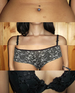
Original photographs:


 -Edited photographs-

 Below four images:
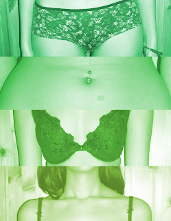
‘Colours’ – ‘Brightness - Contrast’- brightness to 34 – contrast to 18 – ‘Colours’ – ‘Colorize’ – hue to 224 – saturation to 50 – lightness to 30

I like this hue of blue on these four images as I feel that they add a calmness to the image. Instead of the photograph being seen as erotic or provoking, I think that the blue tones make them look more scientific, anatomical and representative to be an example of a natural human body.

Below three images:

I opened a new document on GIMP, 6283× 4215 pixels, I then copied the four digital photographs I took onto individual layers. On my ‘toolbox’ menu I selected ‘current layer only’ to avoid cutting the other layers. From there, I went to each layer and cut the image into a section that I wanted to use. I then arranged the layers so you could see the parts of the body in a jumbled up order. I then cropped the white areas left of the image so only the strips of the body was visible.


                                                                                                                                                          I didn't like the bottom image and the way it sat with the other three as they were taken from directly in front of my model compared to the lower image that was taken from an angle.

                                                                                                                                         I like this image more than the one above as the bottom image is in line with the angle of which I took the other three images.  


Tuesday 5 March 2013

Patrick Hickley

Patrick Hickley

These images were taken from the series titled 'Complex Structures' which consisted of photographs taken of sections of the human body. Hickley then sowed into the photographs, some of the stitching representing veins and arteries, organs and the human skeleton. I find his work interesting as his photographs for this series are produced in tones of blues and white and the colour of the thread is consistently red making it easily visible and contrasting to the image below. His stitching shows quite accurately, one internal aspect of the human body in each image, bringing focus to the image and combining science with art in a visually creative way.

The detail of the stitching is high as you can see that Hickley took into consideration that the neck was turned to the side and almost pulling on the skin. The curves and direction in the stitch follows the curve of the neck and the smaller vessels have been stitched in a way that you would expect them to expand and flow in various directions.

This image is my favourite from this series of images. I think what attracts me most to it is the contrast of the ribcage to the photograph of the male torso. Although the rib cage is always there it cannot be seen outside therefore creating 


Tuesday 26 February 2013

Experiment of Catherine Ulitsky

After looking at Catherine Ulitsky, I really wanted to create a similar effect that she achieved except blocking off an area that would make it near impossible to move around in or even get into. I started off at the other end of the kitchen and tied the end of string to the back of the radiator. I then began to wrap the string around random objects in the kitchen that were not going to move if pulled. After doing this a few times I wrapped the string around more less static objects; i.e. plant pots, and then more secure objects such as the handles to the draws. Once I was happy enough to think I had finished, I tied the end of the string to another handle. I decided to leave it up a while even after I had photographed it to see the reaction of my mother when she opens the kitchen door...


Analysis of Catherine Ulitsky


In this image you can see that Catherine Ulitsky has tied string along the side of the stairs to hooks on the floor and to the hooks on the underneigth of the banister. As far as I can tell, the string has not been crossed-over in a particular way or pattern but done randomly. The sting is a turquoise colour which stands out from the white steps and wall and the black banister.

When looking at this image I find it hard to decipher.

Mini Experiment of Anna Schuleit's Work

After looking at Anna Schuleit's work, I felt really inspired to try and create something similar... However, I unfortunately do not have enough money to buy enough flowers to cover a whole floor of a room let alone a hallway. To compensate for this, I gathered all the plants in my flat and put them in my bath as a representation of her work. I don't think this is a good experiment as I don't find it as captivating. To improve on this experiment, if I can find loads of cheap rose petals then I intend on filling the bath tub with them.


Analysis of Anna Schuleit


After graduating in 1998, Anne Schuleit worked on installations at an abandoned hospital and for the closing down of the Massachusetts Mental Health Center. From there she became a visiting artist at a psychiatric institution in Westborough, which eventually phased out and ended in a closure. She studied painting and then went on to a master's  degree in creative writing / book arts at Dartmouth.

In these photographs, you can see that the whole floor of the corridors are covered with flowers. The corridors are all long and narrow, and in these three images the walls are plain and bare of decoration meaning all focus is on the flowers on the floor. In each photograph, the flowers are the same species in each of the individual corridors.

My initial thoughts of why Schuleit did these pieces, was to create a brightness in those dull corridors by decorating them with nature. I believe there to be definite links to rivers or oceans as all of the images remind me of calm water, due to the still flower bed. It also shows by adding a little bit of nature to a place that had none, makes the area seem a lot brighter and even possibly happier.

I really like Anna Schuleit's work as I imagine the smell of all those flowers in a corridor like those must smell so intense... I like to imagine so much so that maybe some of your other senses are numbed. 

Monday 25 February 2013

Analysis of Pierre Cordier


Georges à la casquette imite Pierre Brasseur, Bruxelles, 1955
Pierre Cordier was born in 1933 in Brussels, Belgium. He is well known for the Chemigram which is a method of creating art with light sensitive paper. Like a photogram, the chemigram is created without a camera, but instead of being in full darkness, it is created in full light. 

In this photograph you can see a well wrapped up man standing in front of what looks like a wooden door with a cigarette in his mouth. He is wearing an old fashioned hat that is usually connected to that of farmers or those who may not be living in a city. His scarf is checked and judging by the shades of grey I assume it has various colours on it. His coat is plain yet looks like it has been made from a thick fabric. Although his hair looks a little wispy, his moustache looks neat and well maintained. Th cigarette in his mouth looks thicker than those of today.

I feel that the meaning behind this photograph is to show this man's routine before he goes out, whether that be to work, to see family or friends, or even for just a walk. I believe it captured a hard working man, a face that has been weathered by the elements yet is still strong and still works. The cigarette could symbolise that he is taking a break, relaxing before he goes to work or treating himself.

I rather like this photograph as it feels like a photograph of what this man does everyday yet because it has been captured in an image, the feeling changes and makes it seem sentimental in a way. I'm sure most could resemble a picture like this to those of old relatives both living and those past. This image has a sense of sentimental value that I don't believe is shown much through the photographic imagery that is being produced today.