Showing posts with label A2. Show all posts

Tuesday, 14 May 2013

Evaluation

Throughout the project my ideas have changed. Originally I started by looking at the five senses and everyday life such as routines and diet. From here I moved onto the human body and showing the inside on the outside. By doing this it creates an in-between state due to the internal organs and or bones shown on the body. 

Catherine Ulitsky was one of the first photographers I looked into in this project and was the reason I started to play around with string, rope and thread. She used thread in a three-dimensional way which illustrated clearly the aspect of space and confinement. The photographer that inspired my final idea and my piece the most is Patrick Hickley. I really liked the concept that was shown through his work and the use of thread to delicately illustrate the internal parts of the body. Both photographers link well together through the use of thread and had a big impact on me near the beginning of the project which stuck with me through to the end.

Through experimentation during this project, I was able to narrow down the use if techniques and materials I wanted to do for my final piece. For example, I ruled out paint due to the fact that when watered down it would not stick to the photographic paper well. Stitching and cutting up my photographs added a more textured effect to my images which I rather liked; especially as I wanted to show the inside on the outside.

I liked the exam theme as it was and is very open allowing loads of different themes within the theme enabling us to think in various different directions. I enjoyed completing experiments to see the different effects and textures I could create on my images. I think I will be pleased with my final outcome bar the number of stitched photographs I will be able to produce due to the length of time it takes to stitch an image.

Wednesday, 17 April 2013

Digital Experiments

Original photographs:


 -Edited photographs-

 Below four images:
‘Colours’ – ‘Brightness - Contrast’- brightness to 34 – contrast to 18 – ‘Colours’ – ‘Colorize’ – hue to 224 – saturation to 50 – lightness to 30

I like this hue of blue on these four images as I feel that they add a calmness to the image. Instead of the photograph being seen as erotic or provoking, I think that the blue tones make them look more scientific, anatomical and representative to be an example of a natural human body.

Below three images:

I opened a new document on GIMP, 6283× 4215 pixels, I then copied the four digital photographs I took onto individual layers. On my ‘toolbox’ menu I selected ‘current layer only’ to avoid cutting the other layers. From there, I went to each layer and cut the image into a section that I wanted to use. I then arranged the layers so you could see the parts of the body in a jumbled up order. I then cropped the white areas left of the image so only the strips of the body was visible.


                                                                                                                                                          I didn't like the bottom image and the way it sat with the other three as they were taken from directly in front of my model compared to the lower image that was taken from an angle.

                                                                                                                                         I like this image more than the one above as the bottom image is in line with the angle of which I took the other three images.  


Wednesday, 23 January 2013

Final Evaluation

At the beginning of this project, we were given the title of 'Personal Project'. This enabled us to continue on from our last project in the direction that we wanted to go in. Within this theme I had to experiment with various techniques and play around with different subject matter.

I started by making a mind map and mood board to help to create some initial ideas for where I could go with this project. I continued my research by completing analysis's on photographers. The first set of photographs I took were based around the idea of the suit (being the urban beauty) vs the casual wear (that of nature - i.e. the person's personal, natural, comfortable style). Using the chemicals in the darkroom, I did various experiments on some of the images from my film. Even after this I still felt that the images were not strong enough to depict my documentary theme of: Nature vs Urban Beauty. I did some handmade experiments involving stitching, ink and painting onto the photographs. For more detail have a look at my Progress Review Of How Ideas Have Change. I did another mind map to help me come up with some ideas for my final film. I also did more research to help broaden my idea spectrum. This gave me the idea to paint on a model and then photograph them.

Leonard Nimoy was my main inspiration for how I should light my final piece as his focus on how the light effects the photograph and the model themselves really intrigued me. The contrast of the black and white made his images more bold and added more depth to them. Jane Deschner's influence was that of the personal ties with the photographs. All of her pieces were photographs of groups of friends, family, the young and old. This emitted the sense of memories and sentimental feelings. Due to this research I decided to use my boyfriend as my model to try and show the personal connections. Lauren Baker inspired me the most in this project. She paints on models and then photographs her work. The idea of painting on the body of the model that will be the focus of the photograph really interested me as it was like documenting an experiment by photographing it.

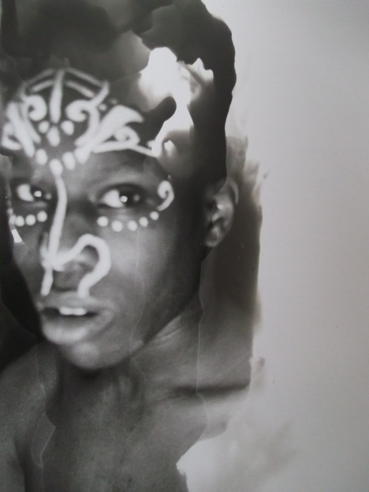
I think that my experiments that I had done in the darkroom with the chemicals were my best prints as I love how it gives an abstract feel to the image yet you can still see the original photograph clearly... depending on how it is done. I really like my final outcome as it has a tribal type feel to it from the paintings on my model and how they have been attached together. The small pinholes in the photographs add a delicateness to the whole piece when the light shines through them.

Instead of using acrylic paint to paint onto my model, next time I will try and find actual body paint to use to avoid the paint cracking and eventually peeling off of the model's skin.

I really enjoyed the project. As always I hope to develop further my darkroom experimental techniques as I love the texture the chemicals can leave on a photograph. Improving my digital editing skills would be beneficial in this technology based world.

Monday, 21 January 2013

Final film digital edits

Using this website- Picmonkey - I digitally edited these photographs.


Thursday, 17 January 2013

Final film darkroom experiments

Vignetting


Selective Developing
 The image below if my favourite out of the three selective developer experiments from this film. I love how the flicks of developer went in the same direction of my model's eye and how you can still see the paint on his face clearly but not so clearly of the rest of his skin.


Solarizing 


Reversals
 The image above, was exposed to light for 20 seconds. I felt this didn't define the detail of the paint and the edge of my model's face enough so I boosted the light timer up to 36 seconds. The improvements can be seen on the image below.
 I love how scary the eyes look of my model in the image below. The eyes combined with the paint makes this image a rather sinister one.