Wednesday 28 November 2012

Progress Review Of How Ideas Have Changed

The materials I have used in this project consist of inks, thread, acrylic paint, photographic paper and the darkroom chemicals along with image editing software. The chemicals in the darkroom I used to create a number of experiments such as selective development, vignetting, dodging and burning some image to lighten or darken an area of a photograph, solarizing and reversals. Some images in this project I have sown into and I have also sown four images onto a t-shirt.

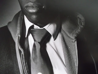
My first film was showcasing the suit made by society to be seen as smart and intelligent v.s. casual wear such as hoodies and caps. Link to images of first film. I edited the photographs and experimented, then went onto looking at photographers as I felt the film I had taken was not enough. My final film was of a model painted, both on his face and one of his arms.

I have researched four photographers / artists and have completed an in-depth analysis on each of them - Jasper Johal - Leonard Nimoy - Jane Deschner - Lauren Baker. Jasper Johal is well known for taking photographs of yoga and dance and has completed many more photographs for various clients. Each of his photographs are focused on the light which surrounds the object of the image. Leonard Nimoy, apart from being a very famous actor in Star Trek, took various beautiful photographs within the groups of 'Classic Nudes & Dance Series', 'Eye Contact' and 'Self Portraits & Hand Series'. Jane Deschner did many pieces of embroidery onto photomonatages of old found photographs of families and friends. Lauren Baker us an artist as well as a well know body painter. She does make up art along with full body painting of various different themes.

Through the many experiments I have done, they have helped me with my ideas. The darkroom experiments helped me to decide that my final film had to be different and not involve suits and hoodies as I didn't feel the images were strong enough with the experiments over them. The sowing experiments made me want to be more hands on with my model and not just on the photographs, which along with researching body painting helped me in the direction of where I wanted to go with the project.

Through experimenting, I have refined my techniques through the learning process. When an experiment did not work as I intended it to the first time, I changed my approach in-order for the experiment to work. For example, when I was first trying to solarize some of my images I put it under the enlarger, exposed it to the correct time that I had decided for the photograph, put it in the developer and as soon as the image began to appear I quickly removed it and put it under the light of an enlarger for a few seconds then placed it back in the developer. This didn't work so, I did all of the same steps except that when the image began to appear, instead of putting it back under an enlarger, I quickly ran out of the darkroom and exposed it to the normal room light outside and then ran quickly back into the darkroom to put the photographic paper back into the developer; and this time it worked. Through trial and error and trying again I developed and improved my experiments.

My most successful experiments have been the photographs where I have played around with in the darkroom. These being the selective developing prints and reversals. I believe my selective development photographs are successful as you can see various layers of the developer due to how I have applied it to the photographic paper along with some photographs having a 'splatter' effect on them. My reversals are successful as they not only bring a negative version of some of my images but change the whole feeling of the image; instead of just a face with paint on, the reversals make the images look evil, even demonic in a way... completely changing the effect of the photograph itself.

I think the experiment that I have been least successful with is that of my sowing ones involving sowing into the photograph. I feel that this experiment has been the least successful as I think that the stitching is not extremely skilful nor even adding a handmade feel to it.

I will definitely be taking my darkroom experimentations further for my outcome as these experiments are the ones I enjoy most and I find them incredibly creative and exciting. I think that this will add to the whole effect of that of my final outcome.

Sunday 18 November 2012

First Film

Test Strip of Contact Sheet
 Contact Sheet

 Test Strip


Friday 16 November 2012

Jane Deschner Analysis


http://www.janedeschner.com/garment__t-shirt_.html
"The quotes and symbols I began embroidering into the photos in 2007 gave me a 
chance to moralize, in sampler-esque form, on some of the thoughts and lessons my maternal self needed 
to share—accountability, acceptance, love, honesty, compassion, integrity, gratitude and generosity."
For thirty years, Jane Deschner has created many photomontages from found images within magazines. For almost a decade, Deschner has collected and altered early to mid Twentieth Century snapshots, portraits, news photographs and movie stills.

When first looking at this image it looks as if the photographs have been sown onto a t-shirt. The images consist of a range of photographs of family and friend group pictures, individuals young and old and the occasional horse and / or car. The photographs are of different colours, the majority of them are black and white prints whilst a few others are sepia coloured. When looking closer at the image, it looks as if the photographs have been sown together to create a t-shirt instead of being sown on a t-shirt. However, there are slight folds at some of the edges which would suggest a piece of material underneath the images. White thread was used to attach the photographs. The sticking is simple helping to keep the focus on the photographs.

I think that this piece of work is definitely about love, whether it is that of family or friends. Life is also a theme as there are photographs of young children and old adults. I think the meaning behind this whole piece is to cherish those close to you and those moments that you wish could last forever but can only be captured in a photograph. Another idea that popped into my head is that is that if someone was to wear that top, they would be wearing their memories and even sharing them as passers by would be able to the images. Perhaps the meaning behind this is to not only remember the past but to visualise it, see it as simply as it was and live your life with love and make even more memories.

I like this piece of Jane Deschner's work, it shows a lot of sentimental feelings as each of the photographs would have a different story behind them. I would prefer it more if it there was more sepia photographs attached or it was completely filled with black and white photographs. Overall I think it is a lovely way to present photographs, especially if they are personal to the person.

Thursday 15 November 2012

Leonard Nimoy Analysis


Leonard Nimoy is most well known from his acting career when he played the character, Mr. Spock in Star Trek. Alongside this he has been a director, philanthropist, and a photographer. In the early 1940s, using the family bathroom as a darkroom, Nimoy began to take photographs. From there, his fascination with photography grew.

This photograph was in the Nudes/Dance series. I was not able to find the name of this photograph. In this image, it is clear that the women in the centre of the image is naked. What looks like fairy lights have been wrapped around her body which illuminates her body in a very interesting and different way (opposed to just one light source). The negative space behind and around the women is black and even the lights on her body have not lightened the background which would suggest that the material or wall is black or very dark when taking the photograph. 

I was not able to find a meaning for this photograph. My initial thought is that because the model was posing with the light source, perhaps the meaning behind the photograph was that everyone has their own light within them, we just have to choose to hold it up and show it. I feel that this image might have a connection with light v.s. darkness. Without one you cannot have the other but as they both coincide, there is a constant battle between the two. Day and night, and internal battles people have themselves. Whether it is just a decision between an unhealthy meal or healthy one, or a decision to hit someone or walk away. 

I really like this photograph as I have not seen a photograph where the light source is being held by the model. I think this adds a really nice effect to the photograph, and the black background helps to make the image seem more dramatic.

Wednesday 14 November 2012

Jasper Johal Analysis


Nudes
"Whether shooting a small piece of jewelry for Energy Muse, or the spacious award winning Jai House for architect Lorcan O'Herlihy, what I am really shooting is light. Light is this beautiful living thing. It wraps, it plays, it suffuses, it cascades. I am self taught, and as I worked on my craft over the years, I never focused on shooting the object. Instead, I focused on capturing the beauty of light as it played around the object, often through the object, sometimes underneath the object. Light dances, and as a photographer I become its dance partner."
Jasper Johal, who lives in California, is the leading photographer for the yoga industry, yet still produces a range of photographs that are used commercially. He has produced photographs for over forty movies posters and video covers. Johal's photographs have been used in the music industry, they have been published on 'Architectural Record' magazine and he has photographed the culinary creations of the world.

This photograph was found on Johal's website within the 'Nudes' category. You can see instantly when looking at the image that the focus of the photograph is the woman stretching and arching her back. She is completely naked except for an anklet on each foot and a ring on her thumb (the supporting hand). The background behind the model is a plain one which gives the photograph a soft touch although the model is in a powerful position.

I found no meaning to this photograph, but my initial thought was that the theme in this photograph was strength. The physical strength of the woman can be seen in the stance / stretch she is in along with the definition of her body. Although there is no extremely huge muscles on her, her body is toned which show exercise and muscle strength training. For her to of taken on this position, perhaps the image shows that she is strong minded as well as strong in a physical sense. She is not worried about people looking at this photograph, nor worried about people judging her. The meaning behind this photograph may be trying to encourage people to be less worried about other people judging them, being yourself even if people do stare. This image could also be a statement about the natural, healthy body. No make up, no body shape changing clothes. Natural hair. My last thought about the meaning of this photograph is that maybe it is suggesting that people shouldn't let themselves be shaped by society, you should shape yourself.

I really like this photograph as it shows the natural beauty of the human body. It shows strength, flexibility and even a love for her personal health. The plain background and floor help add delicateness to the whole image.

7 Day Photo Challenge

day 1: a house

day 2: your shoes
day 3: from a high angle

day 4: from a low angle

day 5: something blue

day 6: time
day 7: people 

Tuesday 13 November 2012

Mood Board of Ideas


Links to the images:
1.        2.        3.         4.        5.        6.        7.        8.        9.        10.        11.        12.

Sunday 4 November 2012

Evaluation Of Final Outcome

The brief that was given to me at the beginning of this project was based around my personal study theme, which at the start I chose it to be a documentary on Nature. Within this theme I had to enhance my images through experimentations and new methods of working, both including finding out new techniques to use in the darkroom and using digital software. 

I started this project by taking photographs of plants as I was going to do a Documentary on Nature. I decided to stay away from the idea of taking landscapes as I live in the city and would be quite hard to find natural landscapes to photograph. I wanted to incorporate graffiti into my photographs so I changed my Documentary to Nature vs Urban Beauty. This way I was able to take photographs of both wildlife and graffiti.After taking various photographs of plants and graffiti I felt that the images were not 'documenting' what I wanted them to. So, when it came to creating a mind map for my final outcome, along with the plants and graffiti idea, I also came up with the idea of 'Nature' being shown through the naked body and 'Urban Beauty' being shown through a clothed body.

Once I had decided that I was going to use a naked and clothed body for my final outcome, I began to look for photographers that used similar subject matter within their photographs. After a little searching, I found Bill Brandt's work which really interested me as his photographs of the naked body, in my mind were captured beautifully.

From the outcome of my images, I think that when I was taking the photographs, the lighting I used and the directions I pointed the light in worked well. I was happy as I felt that the contrast between the black and the white in the photographs helped to define and highlight my model's body. This made the photographs more prominent and made them seem as if they were protruding off the paper due to the hard light. Also, I think that the photographs that I had reversed worked really well as they almost look like photographs from an old film. The photographs that I selectively developed were very fun to create and I feel that they perhaps add a sort of character to the images that the reversals and the positives do not show as vividly. In my outcome's entirety, I am very pleased with how my photographs have come out and the results I have achieved.


If I was to improve my final outcome, I would print some of my photographs on bigger photographic paper so that I had both enlarged and small images next to each other. By having a few larger images, I think that it would make the piece more dramatic and possibly even make it seem more real as the photographs would be closer to life size than the ones I produced. Also, I feel that I could of taken more close ups of certain parts of my model's body so that they was a contrast between close up views and distant ones.

If I was to create more enhanced images in the future, I would definitely focus on different darkroom techniques as I find these the most interesting and enjoyable! I would dabble using digital editing techniques but I do not feel as accomplished once I've finished editing an image compared to creating an image in the dark room. Also, as I am not very confident when digitally editing my photographs, I get quite agitated which sometimes I feel effects the outcome of the image. Due to me enjoying using the darkroom and the processing chemicals, to me my images seem to come out better. Overall, I really enjoyed this project as it stretched me to think outside of the box; I started by taking photographs of plants and graffiti which then led me on to the human body in its natural and urban form.

For the new project, I am unsure what exactly I want to do for it but I will definitely be using the same theme and hopefully extending the boundaries of what I have created so far.