Wednesday 23 January 2013

Final Evaluation

At the beginning of this project, we were given the title of 'Personal Project'. This enabled us to continue on from our last project in the direction that we wanted to go in. Within this theme I had to experiment with various techniques and play around with different subject matter.

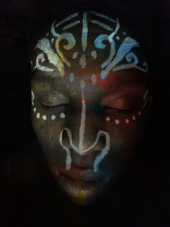
I started by making a mind map and mood board to help to create some initial ideas for where I could go with this project. I continued my research by completing analysis's on photographers. The first set of photographs I took were based around the idea of the suit (being the urban beauty) vs the casual wear (that of nature - i.e. the person's personal, natural, comfortable style). Using the chemicals in the darkroom, I did various experiments on some of the images from my film. Even after this I still felt that the images were not strong enough to depict my documentary theme of: Nature vs Urban Beauty. I did some handmade experiments involving stitching, ink and painting onto the photographs. For more detail have a look at my Progress Review Of How Ideas Have Change. I did another mind map to help me come up with some ideas for my final film. I also did more research to help broaden my idea spectrum. This gave me the idea to paint on a model and then photograph them.

Leonard Nimoy was my main inspiration for how I should light my final piece as his focus on how the light effects the photograph and the model themselves really intrigued me. The contrast of the black and white made his images more bold and added more depth to them. Jane Deschner's influence was that of the personal ties with the photographs. All of her pieces were photographs of groups of friends, family, the young and old. This emitted the sense of memories and sentimental feelings. Due to this research I decided to use my boyfriend as my model to try and show the personal connections. Lauren Baker inspired me the most in this project. She paints on models and then photographs her work. The idea of painting on the body of the model that will be the focus of the photograph really interested me as it was like documenting an experiment by photographing it.

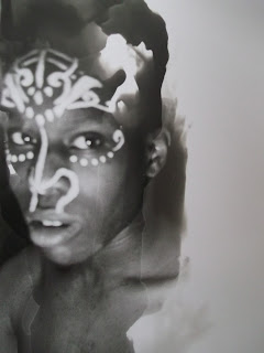
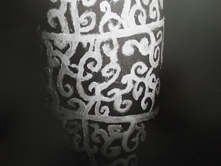
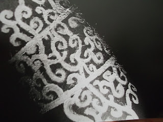
I think that my experiments that I had done in the darkroom with the chemicals were my best prints as I love how it gives an abstract feel to the image yet you can still see the original photograph clearly... depending on how it is done. I really like my final outcome as it has a tribal type feel to it from the paintings on my model and how they have been attached together. The small pinholes in the photographs add a delicateness to the whole piece when the light shines through them.

Instead of using acrylic paint to paint onto my model, next time I will try and find actual body paint to use to avoid the paint cracking and eventually peeling off of the model's skin.

I really enjoyed the project. As always I hope to develop further my darkroom experimental techniques as I love the texture the chemicals can leave on a photograph. Improving my digital editing skills would be beneficial in this technology based world.
Monday 21 January 2013

Thursday 17 January 2013

Final film darkroom experiments

Vignetting


Selective Developing
 The image below if my favourite out of the three selective developer experiments from this film. I love how the flicks of developer went in the same direction of my model's eye and how you can still see the paint on his face clearly but not so clearly of the rest of his skin.


Solarizing 


Reversals
 The image above, was exposed to light for 20 seconds. I felt this didn't define the detail of the paint and the edge of my model's face enough so I boosted the light timer up to 36 seconds. The improvements can be seen on the image below.
 I love how scary the eyes look of my model in the image below. The eyes combined with the paint makes this image a rather sinister one.


Wednesday 16 January 2013

Final film

Test Strip of Contact Sheet
 Contact Sheet

Test Strip - 1 second per shade


Sunday 13 January 2013

Lauren Baker Analysis

Lauren Baker


Since 2008, Lauren Baker has been a professional artist, winning the UK Bodypainting championship and a finalist in the World Bodypainting championships in Austria. Prior to being a make up artist and body painter, Lauren Baker forged a career as a successful portrait artist.

This picture was found on Lauren Baker's website under the group of 'Bodypaint'. You can see that the focus of this image is that of the woman's back that has been painted decoratively. The design on her back is of thin vines / stems with small leaves on them. In-amongst the leaves there can be spotted small flowers dotted around. Also a few small bugs / flies can be seen along with four beetles, one looking like a scarab beetle and a butterfly. Her hair has been stylised so that it is not covering her face which has some make up on matching the design on her back, bluey green eye-shadow to link to the leaves and beetles and pink lipstick to bring attention to the face.

I was not able to find a meaning to this photograph, but my initial thought is that there is a definite link to nature and life. Perhaps it was painted to remind people that even though bugs, beetles and plants are seen as rather inferior to humans, they are still living things and should be respected any possibly even cherished as they are not the most common sightings when it comes to looking at nature. I also feel that this photograph shows that painting on the body whether permanently or not is a natural human thing to do. After all, there has been historical recordings of not only war paint but ceremonial paint / tattoos which can still be seen in some parts of the world. Perhaps this is a statement against those who are against people getting tattoos, painting their body and maybe even wearing make up.

I really like the work Jane Baker has painted on this woman's back, as I have a love for the natural world this specific piece is very close to my heart. I am also a fan of body paint and tattoos so this image helps to advertise the beauty of the art. The plain grey background helps to give all focus to her back.

Wednesday 9 January 2013

Final Film Mindmap


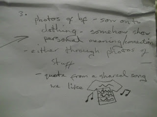
I came back to this mindmap with an unsure mind whether this was what I wanted to do for my final outcome. I liked the idea of taking photographs of a model who had been painted on but attaching them to a t-shirt or other piece of material seemed like a very 'random' idea as the photographs do not have a connection with being attached to a t-shirt. I still plan on taking high contrast, black and white photographs of a model with parts of their body painted but I intend to completely change the presentation of these photographs. Instead of attaching them to an item of clothing, the photographs will be mounted onto a piece of card for a more formal presentation which will allow more focus on the photographs themselves.