After looking at Catherine Ulitsky, I really wanted to create a similar effect that she achieved except blocking off an area that would make it near impossible to move around in or even get into. I started off at the other end of the kitchen and tied the end of string to the back of the radiator. I then began to wrap the string around random objects in the kitchen that were not going to move if pulled. After doing this a few times I wrapped the string around more less static objects; i.e. plant pots, and then more secure objects such as the handles to the draws. Once I was happy enough to think I had finished, I tied the end of the string to another handle. I decided to leave it up a while even after I had photographed it to see the reaction of my mother when she opens the kitchen door...
Tuesday, 26 February 2013
Analysis of Catherine Ulitsky
In this image you can see that Catherine Ulitsky has tied string along the side of the stairs to hooks on the floor and to the hooks on the underneigth of the banister. As far as I can tell, the string has not been crossed-over in a particular way or pattern but done randomly. The sting is a turquoise colour which stands out from the white steps and wall and the black banister.
When looking at this image I find it hard to decipher.
When looking at this image I find it hard to decipher.
Mini Experiment of Anna Schuleit's Work
After looking at Anna Schuleit's work, I felt really inspired to try and create something similar... However, I unfortunately do not have enough money to buy enough flowers to cover a whole floor of a room let alone a hallway. To compensate for this, I gathered all the plants in my flat and put them in my bath as a representation of her work. I don't think this is a good experiment as I don't find it as captivating. To improve on this experiment, if I can find loads of cheap rose petals then I intend on filling the bath tub with them.
Analysis of Anna Schuleit
After graduating in 1998, Anne Schuleit worked on installations at an abandoned hospital and for the closing down of the Massachusetts Mental Health Center. From there she became a visiting artist at a psychiatric institution in Westborough, which eventually phased out and ended in a closure. She studied painting and then went on to a master's degree in creative writing / book arts at Dartmouth.
In these photographs, you can see that the whole floor of the corridors are covered with flowers. The corridors are all long and narrow, and in these three images the walls are plain and bare of decoration meaning all focus is on the flowers on the floor. In each photograph, the flowers are the same species in each of the individual corridors.
My initial thoughts of why Schuleit did these pieces, was to create a brightness in those dull corridors by decorating them with nature. I believe there to be definite links to rivers or oceans as all of the images remind me of calm water, due to the still flower bed. It also shows by adding a little bit of nature to a place that had none, makes the area seem a lot brighter and even possibly happier.
I really like Anna Schuleit's work as I imagine the smell of all those flowers in a corridor like those must smell so intense... I like to imagine so much so that maybe some of your other senses are numbed.
Monday, 25 February 2013
Analysis of Pierre Cordier
 |
| Georges à la casquette imite Pierre Brasseur, Bruxelles, 1955 |
Pierre Cordier was born in 1933 in Brussels, Belgium. He is well known for the Chemigram which is a method of creating art with light sensitive paper. Like a photogram, the chemigram is created without a camera, but instead of being in full darkness, it is created in full light.
In this photograph you can see a well wrapped up man standing in front of what looks like a wooden door with a cigarette in his mouth. He is wearing an old fashioned hat that is usually connected to that of farmers or those who may not be living in a city. His scarf is checked and judging by the shades of grey I assume it has various colours on it. His coat is plain yet looks like it has been made from a thick fabric. Although his hair looks a little wispy, his moustache looks neat and well maintained. Th cigarette in his mouth looks thicker than those of today.
I feel that the meaning behind this photograph is to show this man's routine before he goes out, whether that be to work, to see family or friends, or even for just a walk. I believe it captured a hard working man, a face that has been weathered by the elements yet is still strong and still works. The cigarette could symbolise that he is taking a break, relaxing before he goes to work or treating himself.
I rather like this photograph as it feels like a photograph of what this man does everyday yet because it has been captured in an image, the feeling changes and makes it seem sentimental in a way. I'm sure most could resemble a picture like this to those of old relatives both living and those past. This image has a sense of sentimental value that I don't believe is shown much through the photographic imagery that is being produced today.
Analysis of Roxanne Worthington
 |
| The Letter, 2008 |
Roxanne Worthington owns a studio and has been teaching photography classes for a few years now. She fell in love with photography the first night she spent in a dark room, printing a roll of black and white film. Worthington has had her work shown both nationally (CA) and internationally.
This photograph, The Letter, 2008, was in the 'And So to Dream' series of images. In this photograph you can see a mug and an open envelope with something inside, presumably a letter. It looks like both the mug and envelope are situated on a brown surface, possibly wood. In the background of the image it looks like there is a type of shojji screen. There is a strong contrast between the shadows and the light which due to the lines, suggests it is coming through a window with blinds.
I think that the meaning of this image ties in with the simplicity of the layout. From looking at the photograph I get a strong sense of a comfortable life. Not a lot of money but not poor, enough money to relax every now and then with a cup of tea or coffee whilst reading a letter. This image creates and reminds me of sentimental memories. Not of a specific day or event but the 'simple' things in life. That drink from you favourite mug or a message from someone close to you. This photograph definitely screams sentimental value.
Tuesday, 12 February 2013
Digital Photographs and Experiments
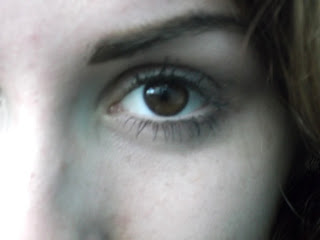
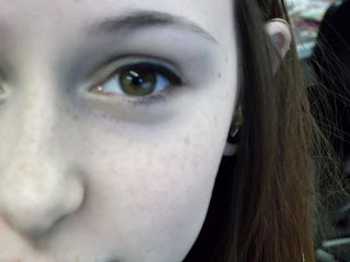
I decided to take some photographs of eyes to relate to the first starting point I chose, 'The Senses'. I took photographs of eyes as I personally think it is one of the most precious senses, and the outside beauty of them is just as interesting to me.
Original Photographs:-
Photographs edited online using Pic Monkey photo editor:-
Warhol Effect
Posterize Effect
The Two Staring Points I have Chosen: The Five Senses & The Everyday
The Five Senses
I chose this starting point as it would be a struggle to live without any of the senses and would be interesting to try and photograph.
I plan on looking at other photographers' work and looking at the visible senses such as the eye (sight).
Artists of interest that fit within the starting point:
-Carsten Witte
I want to do experimentations with double exposures in the darkroom through sandwich printing. Creating handmade negatives to go over photographs could look interesting. I hope to explore a 3D element with photographs related to the senses so people can touch them. Also maybe explore a way of making the photographs fragranced.
The Everyday
This starting point is around us everyday making it easily accessible to photograph.
I plan on looking at other photographers' work and keeping a closer eye on what I see on a day to day basis along with routines.
Artists of interest that fit within the starting point:
Like before I want to do experimentations with double exposures in the darkroom through sandwich printing. Creating handmade negatives to go over photographs could look interesting. With photographs of the everyday, I intend on doing digital experiments which will involve manipulating the images so they do not look so 'ordinary' or 'everyday'. I will also play around with the tones of the images in the darkroom.
Subscribe to:
Comments (Atom)


