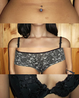
Original photographs:
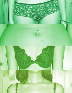
-Edited photographs-
Below four images:
‘Colours’ – ‘Brightness - Contrast’- brightness to 34 – contrast to 18 – ‘Colours’ – ‘Colorize’ – hue to 224 – saturation to 50 – lightness to 30
I like this hue of blue on these four images as I feel that
they add a calmness to the image. Instead of the photograph being seen as
erotic or provoking, I think that the blue tones make them look more scientific,
anatomical and representative to be an example of a natural human body.
Below three images:
I opened a new document on GIMP, 6283× 4215 pixels, I then
copied the four digital photographs I took onto individual layers. On my ‘toolbox’
menu I selected ‘current layer only’ to avoid cutting the other layers. From
there, I went to each layer and cut the image into a section that I wanted to
use. I then arranged the layers so you could see the parts of the body in a
jumbled up order. I then cropped the white areas left of the image so only the
strips of the body was visible.
 I didn't like the bottom image and the way it sat with the other three as they were taken from directly in front of my model compared to the lower image that was taken from an angle.
 I like this image more than the one above as the bottom
image is in line with the angle of which I took the other three images.


