Friday, 2 November 2012
Finalised Idea
From looking at Bill Brandt's work, it enforced one of my ideas; that being that sometimes simpler is better. So, for my final outcome, I will produced images from the recent film I took and mount them onto black card. I will also edit a selection of the images using various darkroom techniques and mount them on black card too. I have decided to use black card instead of white card as I think that it will focus the attention on the photographs, whereas white card has a tendency, under the wrong light to seem quite bright.

Thursday, 1 November 2012
Bill Brandt Analysis
 |
| Link to image. |
When first looking at this photograph, it is clear it is of a naked person in a pose which covers all of what is seen as 'inappropriate areas'. It is hard to determine whether this model is a woman or a man as the face is covered and the hair not easily seen. The setting of the photograph was taken inside, perhaps in a house, flat or even a hotel. After looking at the image for a while, it becomes clear that this photograph was taken at an angle looking slightly upwards. The body itself looks straight yet the background looks as if it is on a slant.
I could not find a meaning for this photographer. However, as the sex of the model is undetermined, I can't help but feel that Brandt wanted to portray a meaning through this. What is usually seen as beauty is covered e.g. the face, hair, torso and even the hands. A meaning could be put to this image that too much attention and judgement is given to the outside beauty opposed to inner beauty and personality of a person.
I personally really like this photograph as it captures the beauty of the human body without making it sexual. The fact that you can see every goose bump on the model's legs at to the 'realness' of the whole image.
Wednesday, 24 October 2012


Saturday, 20 October 2012



Sunday, 14 October 2012


Wednesday, 10 October 2012
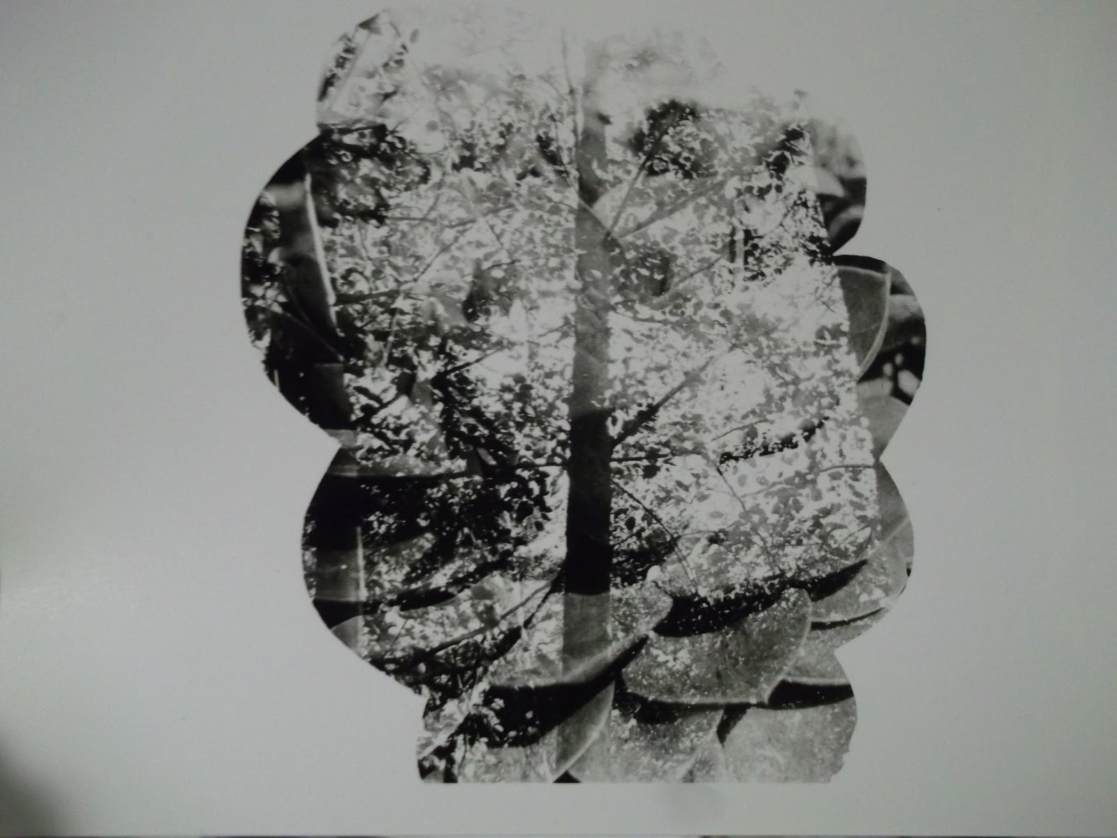
In-Depth Review Of Experimental Work
The first
experiment I did was on Adobe Photoshop, which involved dragging one of my
photographs I had taken into Photoshop and then editing the colours and adding
text. I enjoyed creating this effect on my images as it added a story /
background to the image from some words that stuck out. However, I do not think
this is a good way of showing off the photograph as it is hard to see the
detail of the image due to the colour changes and especially the writing over
the image.
I really enjoyed
the experiment involving painting on leaves and pinecones. It was inspired by
Norm’s Magnusson’s work. After the paint had dried, I placed the painted leaves
amongst other plants and took photographs of them.
Although it was
quite time consuming, the experiment inspired by Abigail Reynolds’s was very
interesting to do. It gave me more ideas about my work as she used two
different contrasting images or two images of the same thing but one being a
different colour. This helped me to think that I can take photographs of
contrasting things and both can still link to my theme.
Geraldine
Georges’s collage and illustration experiment was quiet enjoying to do as I
experimented with loads of various Adobe Photoshop tools that I possibly might have
not used otherwise. There were no limits on what I was able to do; it was quite
frankly an experimentation.
When looking at
Jamie Beck’s animated gifs, I really wanted to try to create some myself. I
took photographs of some of my friends pulling various faces and then uploaded
the images onto Photoshop to create a gif.
After completing
some experimental work inspired by William Hatch Crosby, I felt that painting
patterns on plants didn’t really have the same impact as what Crosby’s work.
Painting patterns on people’s faces seem to work better visually as they look
like they are wearing masks. I think that it is easier to read into the meaning
in the photograph when the paint is on an image of a face rather than a leaf.
Amy Friend poked
holes through her photographs which made them almost seem to glow. When I did
this on one of my photographs, I felt a bit disappointed as it did not have the
same glowing and sense of ‘magic’ to the image. However, it does inspire me to
do this on Adobe Photoshop in the future as I would hopefully be able to
achieve the glow around the hole.
I enjoyed the
weaving experiment although it was aggravating at times when the strips fell
away from where I had placed them. This experiment was inspired by looking at
Greg Sand’s work. I prefer his work to my own as he weaved images of people’s
faces which are a lot more easily recognisable than the reflection of trees.
I loved making a
3D image. After looking at Rebecca Chew’s work I decided to print out one of my
photographs bigger using the photocopying machine. I then folded the paper to
turn it into an origami flower. I thought this was very fitting as the
photograph itself was of bunches of flowers growing from a plant. In the future,
I will definitely keep this way of working in mind.
I also looked at
Stacey Page who sows onto her images which gives the image a texture other than
that of photographic paper. She mainly sewed onto people’s faces which looked
as if they were wearing masks or headdresses. After I did this to one of my
photographs, I definitely think that it can only work on certain images.

Wednesday, 26 September 2012


Saturday, 1 September 2012


Saturday, 28 July 2012


.jpg&w=492&h=480&ei=b_e1UMrDI8uL4gT2lIDQAQ&zoom=1&iact=hc&vpx=231&vpy=276&dur=722&hovh=222&hovw=227&tx=142&ty=127&sig=103542587607570462315&page=2&tbnh=128&tbnw=117&start=33&ndsp=36&ved=1t:429,r:41,s:0,i:209)
.jpg&w=543&h=750&ei=b_e1UMrDI8uL4gT2lIDQAQ&zoom=1&iact=hc&vpx=4&vpy=275&dur=67&hovh=264&hovw=191&tx=106&ty=184&sig=103542587607570462315&page=2&tbnh=138&tbnw=100&start=27&ndsp=36&ved=1t:429,r:57,s:0,i:257)


Subscribe to:
Posts (Atom)