Monday 6 February 2012

Light Project Evaluation

Light Project Evaluation

For this project I was required to research different types of lighting and photographic techniques, look up photographers and relate what they have done in their work to mine. This project involved me looking at other photographers work and how they created some of their photographs and experimentation with different photographic techniques to portray the use of and meaning of ‘light’ in as many different ways as possible. The aim of this project was to present the concept of ‘light’ in a creative and a diverse way through different lighting techniques and different personal views of how ‘light’ can be used and portrayed in a photograph.

In this project, I looked at Crystel Lebas, Pablo Picasso and Patrick Rochon. The image I focussed on when looking at Crystel Lebas’s work was a photograph taken from her book: ‘Between Dog and Wolf’. I liked that Crystel Lebas had chosen the particular area that she had to take the photograph, as the rocks to the right of the image add a sort of heaviness to the image that wouldn’t have been achieved if the image consisted of all trees. The meaning of the image was unclear but that made me like the photograph more as there were so many interpretations to be made such as the battle between the domestic dog taking over from the wolves. When looking at Pablo Picasso’s light drawings, I was pleasantly surprised as I was used to viewing his paintings and did not know of his photographic work. I mainly focussed on his ‘Three Picassos, One Version’ as it showed Picasso in three different positions drawing with light. I liked this effect as not only what he was drawing was part of the photograph, but Picasso himself was caught in the various stages and positions he was in when creating the photograph. This added another dimension to the light drawing. All of Patrick Rochon’s work consists of light drawings or ‘light paintings’ as he likes to refer to them as. I focused on two of his photographs, one coming from the series ‘SUPERNOVAE – Fashion Through the Eye of Light’ and the other photograph from the series ‘Nude Light Paintings’. Both photographs involved a model in which the light was created around and over them. I really liked his work that I looked at as he tends to focus on creating an emotion through the light painting by use of colours, shapes and of course the models is used.

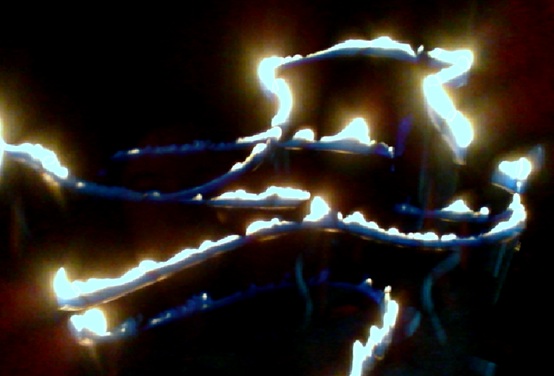
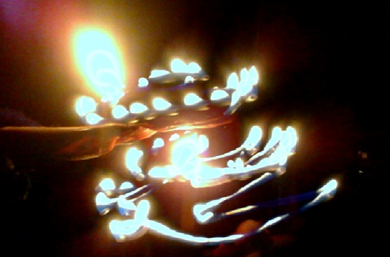
Having analysed a photograph of both Pablo Picasso’s light drawing and two photographs of Patrick Rochon’s light drawings, I decided to play around with the different shutter speeds on my camera and also used an online program called ‘Glow Doodle’ to create my very own light drawings. From looking at Picasso’s photograph, it was clear to me that if you unintentionally get caught in the image when producing a light drawing, it doesn’t matter as it can add to the effect whether it helps explain your light drawing or adds an eeriness to it. So, when creating light drawings in the dark room and on Glow Doodle, both my models and I can be slightly seen in some of my light drawings. Patrick Rochon inspired me to use tissue paper over the torches I used to create colourful light drawings. On both Glow Doodle and my digital camera, I used a combination of white torch light and coloured torch light to create more interesting effects. I also then experimented using Adobe Photoshop by placing an image of a model that I had already taken onto the canvas and edited the image so that it looked like I had created a light drawing around her, when in fact it was a pen tool I had used on Photoshop. Crystel Lebas did not inspire me as much as Picasso or Patrick Rochon, but she did inspire me to not just take photographs during the middle point of the day, but to look to take photographs towards the beginning of the day and towards the end of it. A few days on my way to college, I stopped to take a few photographs of the morning sky as it had hues of blues, pinks, oranges and yellows in it. I also went outside during the evening a few times when the sky was particularly clear of cloud formations to capture lovely sunsets when the sky was filled with brilliant oranges and yellows.

I have enjoyed this project as it was an ‘open’ title that could be taken in many directions (almost like light when it is bounced off of mirrors or other shiny surfaces), allowing me to come up with more ideas that could be linked to the title ‘Light’ and the photographers I have looked at. In this project, I have been generally pleased with the quality of how my portrait photographs, still life photographs, light drawings and photographs of the lighting in the sky taken with my film SLR and digital camera came out. Although, when I was taking the still life photographs with my film SLR and my digital camera of various objects in my classroom, I feel that there was not enough light experimentation with the lamp. So, in the future, I will move the lamp (or whatever light source I may be using) more often and into more unusual positions to create drastic shadows and soft highlights.

I was pleased with how my light drawings came out in this project and would definitely enjoy experimenting further with this technique.Mainly from looking at Patrick Rochon’s work, I would most certainly want to experiment further by creating light drawings involving a model as a focus of the photograph opposed to a template used in the creation that does not show up in the final outcome as I feel that I was just focusing on how to manipulate the light rather than incorporating models into the manipulation of the light. 

Still Life - Photo Album

In order for me to achieve my desired effect when I was taking the photographs of an empty photo album I recently acquired, I had to wait until it was dark outside to that I could use my torch to create bright light and sharp, dark, contrasting shadows. This type of lighting used in photography is known as hard light; and as I was using a torch for the light source, these photographs also fall under torch light photography.

I positioned the torch to the left of the open book so that the light fell onto more pages to the left causing a slight gradual fade into shadow and then a sharp drop of complete darkness. I edited this image so that the photograph was black and white as I think it makes the image 'crisper'.
I directed the torch light from the same level as the bottom surface, directly onto the  tips of the pages, leaving the top of the photo album in shadow.
This was the original photograph I had taken of the cover, however I thought it would look more appealing in black and white as you would be able to see the light and the dark contrast a lot more.

Morning and Sunset

These photographs of morning light and evening light are a perfect to show the different types of natural light created at the opposite ends of the day.

On my way to college, I stopped and took these two photographs of the morning light in the sky.


One evening, I managed to catch the sunset at the top of my road which was truly beautiful and so I took a few photographs as I didn't want to miss this perfect example of natural light.


Still Life - Candles

I took a selection of still life photographs of candles as candle light many, many years ago used to be our only source of light indoors; and is still used today as decorations and for religious purposes. I took these photographs in the evening so that it was fully dark in the room with only the flame producing light.

This was the first photograph I took of that candle. I decided to take a front view of the candle as base point to see how the lighting came out on my digital camera before I tried different angles.
I took this image slightly off focus to try and add an effect of heat to the photograph that you would feel if you placed your hand near to the candle.
I really like this close up as I feel that it catches the essence of the candle and the heat of the flame that is causing the wax to melt around the wick.
This photograph shows a nice side profile of the candle and how the flame illuminates even the base of the candle.
This photograph caught the glow of the naked flame the best as the candle seems to be 'glowing' a bit more than the other photographs.

Still Life - Plants

I took these two photographs as a way of comparing 'cold light' and 'warm light' to show the effects it can have on an image and what feelings and emotions are portrayed. Although the photographs are not exactly the same, the light source that was used to illuminate the leaves was different in each photograph.

The light used for this image was the natural light falling in through the window which gave a 'colder' feel to the photograph.
The light used for this image was a lamp directed onto the leaves from the side, giving both the leaves and the wall behind a 'warmer' feel to the photograph.

Light Drawings Using Adobe Photoshop

Alongside creating actual light drawings with a camera on a low shutter speed, light drawings can also be created on Adobe Photoshop, on top of both plain backgrounds and photographs that have already been taken.
To start off, create a plain canvas or upload a photograph to Photoshop as your base layer. You then need to create a new layer on top of this layer so that all the work is done on this layer and doesn't ruin the plain background or original photograph if something goes wrong. Next, click the free-form pen tool and begin to design any pattern or letters. Once you have finished doing this, click on the brush tool, look at your brush pre-sets and change them to how you want them, by clicking on shape dynamics you can change the pressure of the brush stroke to your liking. Make sure your colours are set to white, click on the path box and select your path (the path is the design you drew with the pen tool), click and select 'stroke path' then make sure the tool 'brush' is selected and to make sure 'simulate pressure' is selected, tick the box next to it. By clicking okay, your lines will then become thicker and more visible to the eye. Make sure the layer with your paths is selected, click the drop down menu and go to blending options. Within blending options, click outer glow and play around with the settings until you are happy with the opacity and blending mode. Click on the colour box to choose a colour for your lines. Play around with the size and the spread to see what impact it has on your lines. Once this is done, click on inner glow and again it will bring up a similar dialogue box to the outer glow box. Once you are happy with these settings, click OK and create a new layer on top of your current one. By selecting the same pen tool used before, draw a few more lines close to the ones you have already created so that when edited it will look like more movement has been going on. Do the same steps as before, once you have simulated your path. Change the opacity of the line (found above the layers) to a more translucent percentage. Then click on 'filter', 'blur' the 'Gaussian blur' and adjust the radios to your liking. Finally, go back to the layers that had the paths in them and click delete.
I initially started on a plain black background so that I could see the effects and types of brush strokes clearer so that I was more confident about using these tools when I went on to actual photographs I had taken.
The faded lines are an example of when you add a third layer and draw more lines to simulate more movement on the image.
Once I felt confident about using the tools to create a similar effect to light drawings, I then moved onto create patterns on photographs I had taken earlier on in this project.
As you can see, by following all the steps above, your photograph will appear like this (obviously with a different design and colour). To change the colour of your photograph to make it fit in better with the colours you have used for your lines, select your background layer (which should be your photograph), click image at the tool box at the top of the screen, click 'adjustment' and select 'hue/saturation'. On the dialogue box that appears select 'colourise' and move the hue arrow to the colour that is similar to your line colour. Your ending image should then look like the image below.


Light Drawings Using A Digital Camera

To create these drawings, I used the dark room at college as it is perfect as it was made so that no light entered the room until the lights are turned on. Before I turned the lights off, I set the digital camera on a tripod and adjusted the focus of the lens so that everything was clear. The lights were then turned off and the light drawing began.
This was not the initial intention when I took this photograph but after looking at it, I like the way my model's head was blurred when the light was on her. This image was originally in colour and you could see my model's hair colour, top colour etc, however I preferred to change it to black and white as it reminded me of those creepy old ghost photographs.
I did this to see how well the lines would come out on the camera when moving it at a fast speed.
I overlapped the light in a curvy fashion to represent waves.
I achieved the faint yellow glow by placing yellow tissue paper over the torch I was using.
Star
Like the light drawing above, I placed yellow tissue paper over the torch.
I drew a star as it is a direct link to light along with the fact it was drawn with light.
X
To create this image I used to torches, one covered in blue tissue paper (because of the way the light travelled through the paper, on some photographs the colour looks purple) and the other covered in yellow tissue paper. I used both torches at the same time, crossing over each other to create a cross (x).
Like the drawing above, I used two torches at the same time to get two different coloured circles.
The reason I drew two patches of 'zig-zag' lines was to see the effect the different colours made in a light drawing photograph. In my mind the blue seems to hold an emotion whereas the yellow light seems more of a magical essence that can be used to highlight people if used.
Smile.
This is one of my favourite light drawings. Like before I used both torches at the same time, and from working at opposite ends I managed to create a smiley face that was half blue and half yellow.
Seeing as the digital camera I was using had a maximum of 5/7 seconds when holding the shutter speed  down, I drew my name in six individual photographs. When it came to the 'g' and the 'e' I had to reverse the letters when I was drawing them with the torch so that they came out the right way in the photographs.
Angel.
As you can see in the three images below, this angel took three stages to complete.  The digital camera I was using did not have a longer shutter speed than 5/7 seconds, so there was simply not enough time to draw the halo and the two wings in one shot. I asked my model to stay very still and in the same position in order for my idea to work. I drew the halo in one shot, and drew each wing in a different shot also, giving me three light drawings. I uploaded all three onto one of the Macs at college and opened Adobe Photoshop. Using the layering tools, I placed all three photographs on top of each other so my model's body 
corresponded and then edited the blending options in order for all of the light I had drawn (the halo and both wings) to show through onto one image. Finally, I changed the photograph to black and white as I think the light drawn contrasts better with the black background.


Inspiration from Patrick Rochon's 'Nude Light Painting' Collection

Having analysed a photograph from Patrick Rochon's Nude Light Painting collection, I felt inspired to try and achieve a similar effect that he achieved in his photographs. In this collection, the way the light had been drawn almost looked likes flames. In response to this, (using glow doodle) I used a gas cooker light  and by moving it across side to side it created a unique effect of disjointed flames. In these light drawings I used my hand and face to act as the bare skin untouched by the fire.


Patrick Rochon Analysis

Patrick Rochon Analysis - Nude Light Painting
Patrick Rochon is a light painter. Since 1992, he has been painting with light in photographs, videos and even live performances. With over 19 years of experience, Patrick Rochon has produced light painting photography for numerous rock and fashion magazines, CD jackets, DVDs, posters and various other promotional material. Patrick Rochon is also the first prize winner at the Nikon photo contest in Japan. ‘My work is about the movement of light cumulating through time and space. My mission is to get the greater public to know what light painting is, and for it to be recognized worldwide as a form of art.’ – Patrick Rochon.


The photograph I am looking at is in the collection titled: Nude Light Painting. The background used for this photograph is plain black either created by a black curtain or wall and also a black floor. When looking closer at the photograph, you can see that the main shape in the centre is a female model lying down naked with her arms outstretched. Over her body, golden/white light has been shone onto her to create an electrifying aspect across her that almost looks like a form of liquid that radiates off of her skin, yet is her skin at the same time. Around the models body, golden/white light is used again to highlight her outline and also smear it. The lines drawn around her body have been created to look like they are coming off of her, almost like flames. Thinner lines of white can be seen around her head, possibly representing hair, and around her hands and legs.


From my research, it was clear that Patrick Rochon created this series of ‘Nude Light Painting’ to, in his own words, ‘create a world where you can see, feel and imagine the essence of sexuality and eroticism, to bring beauty into to it, to redirect it into the feeling rather than the look of sensuality and to have the light show as much as it’s hiding the subject leaving lots of space for your own interpretation.’ Looking at this particular photograph, like the others in this series, the use of light engulfs the model’s body possibly representing the emotions and sensations that could take over. Only remnants of the model’s skin is left untouched by the light, this could mean that being in such a scene not only shows your skin, but who you really are through the intimacy of the moment. The black background could represent the lack of attention to what is around people when they are ‘caught up in the moment’. The body itself looks almost liquid by the way the light has been drawn across it, maybe suggesting how some people melt together or at others feet. The way light comes off of the body seems almost flame like, contradicting the liquid centre as the flame like light suggests passion and the hot body temperature of the model’s body. Another interpretation of this is that, on the outside the model comes across as a hot, passionate lover, when really on the inside, she is as delicate as water when it comes to loving another. The white light adds a cooler feel to the whole photograph, a calmer sense of love rather than passionate lust.


I really like this photograph and the subtleness that it holds. The use of the light covers the body enough to make it a non-inappropriate image and a very delicate one that holds and shows beauty in the human form. The way the light seems to radiate off of her body in a way that could never be seen by the naked eye, gives this photograph a magical sense to it and a most definitely sensual feeling about it, in an unusual calm way.

Inspired Light Drawings

Patrick Rochon's Light Painting Video demo reel

After watching this video, I was really inspired to create light drawings that were not specific shapes or words. Using the online website, Glow Doodle, by placing tissue paper over my torch I did quick movements and flicks of my wrist to create abstract light drawings of colours over lapping and entwining. 


Patrick Rochon Analysis

Patrick Rochon Analysis - SUPERNOVAE – Fashion Through the Eye of Light
Patrick Rochon is a light painter. Since 1992, he has been painting with light in photographs, videos and even live performances. With over 19 years of experience, Patrick Rochon has produced light painting photography for numerous rock and fashion magazines, CD jackets, DVDs, posters and various other promotional material. Patrick Rochon is also the first prize winner at the Nikon photo contest in Japan. ‘My work is about the movement of light cumulating through time and space. My mission is to get the greater public to know what light painting is, and for it to be recognized worldwide as a form of art.’ – Patrick Rochon.


The photograph I am looking at is in the collection titled: SUPERNOVAE – Fashion Through the Eye of Light. The original background colour is unclear by just looking at the photograph, as it is a combination of reds, light and dark purples and hues of oranges to yellows. In the centre of this photograph you can see a model in complete focus wearing tight, black clothing placed in a position that seems unnatural to the eye. Around her, using a white light that seems light blue at some points, Patrick Rochon followed the outline of the model’s body partly and then drew the light across part of her face and body in a wispy looking way. To the left of the model, a bright yellow colour accumulated of lines of light is placed in such a way that could suggest shadow; however parts of the yellow colour has been drawn across the model and her clothing suggesting otherwise. To the right of the model, lines of red and yellow seem to of been drawn coming from behind the model which contrasts the dark purple area that lies just beyond them. To the left of the photograph, golden yellow spherical shapes are dotted about with some having an outer glow to them, contrasting the dark purple and the red/purple colours behind them.


As far as I know through the research I have done, this photograph and the others within this collection (SUPERNOVAE – Fashion Through the Eye of Light), were created for a fashion shoot to use in a commercial version of light painting for a fashion client. Part of the title for this collection being ‘SUPERNOVAE’ could suggest the reason for the choices of colour in this photograph, all of them being hot fiery colours except for the dark purples. Simply, the reds, oranges and yellows could represent the different heat within fire, the purple could represent the aftermath of fire i.e. the burnt edges of the photograph as the fire leaves that area; and the white light surrounding the model and her skin could represent the hottest part of the fire, possibly even the source of the fire, leaving her clothes black – burnt. Another interpretation of this photograph could be that of emotions. The model herself, on the outside seemingly cool and relaxed represented through the use of white light surrounding her and the fact her face is turned to the side, suggesting deep thought. However, on the inside, a flood of emotions being both hot and cold, but mostly intense passion that could be the emotions within and surrounding either love or anger or both. The reds, oranges and yellows being the ‘fiery’ passion of an emotion or several; and the darker patches of purple representing the harder emotion spectrum of either hate or hurt or a mixture of both.


I really like this photograph as I think the light painting itself is extraordinarily beautiful and highlights the model perfectly. The whole photograph has been created in such a way that nothing seems or feels out of place. The model is connected to the light as some of it seems to be faded across her but she is still easily the centre of attention in the photograph. The warm colours in the photograph make it feel more inviting to the eye and as you look closer at the photograph, the various coloured lights around the photograph make it that more magical.


This is a video of Patrick Rochon's SUPERNOVAE – Fashion Through the Eye of Light:

Sunday 5 February 2012

Light Painting Video by Patrick Rochon and Aurora Crowley.

Light Drawings Using Glow Doodle

Using the site Glow Doodle, I created my first light drawings. Glow Doodle connects to your computer webcam and slows down the image that it is recording, just like slowing down the shutter speed on a camera to create light drawings. To obtain the images I had created, Glow Doodle requires people to upload their light drawings onto their site. To avoid this, I quickly took 'screen shots' after I was happy with each drawing and then cropped them down to just the light drawing themselves.
To make the light coloured, as I was using a torch which produced white light, I placed different coloured tissue paper over the bulb of the torch so that when the light shined out, the light would be the colour of the tissue paper.


I thought it was appropriate to use green for the peace sign.
I experimented with the torch underneath my face in different positions with different coloured lights to see what effect it created.
What more to create?
Using the orange tissue paper over my torch, I drew a star in the air as stars are a form of light that we see at night, and very occasionally during the day.

This was my attempt at a palm tree.
Two coloured love heart.
I created this by covering one torch with red tissue paper and another torch with green tissue paper, and used both my hands at the same time to create the heart.
Embryo.
This was my attempt at drawing an embryo as its life is guarded  intently by its parents and when it is born, the parents' life is focussed fully around it, like our life is focused around the sun. Our light.
This was me experimenting with holding different colours under my face for an eerie effect.
I think it worked rather well.